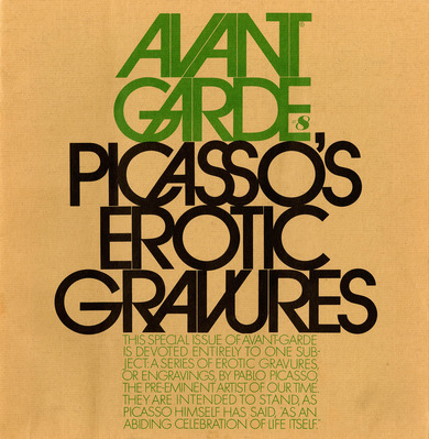
Avant Garde
I simply love the idea that there existed a network of artists who worked in physical isolation, but exchanged their work. It seemed a superb social outlet for creativity, not tied up with money and profit; a social function bound up with ideas of mutual respect, tolerance, democracy, the lot. And it was fun!
Keith Bates on his role as a pioneer of the Mail Art movement, 1996
In the 1960s, the idea for an art and political magazine titled Avant Garde was hatched. Herb Lubalin was in charge of the graphic design. With touching, overlapping and merging uppercase letters, he constructed a dynamic sans-serif well suited for emphasis, advertising and logos. His inspiration came from the wife of the magazine's publisher, Soshanna Ginzberg, who suggested he think of aeroplanes taking off: “Think of a jet aeroplane that's lifting off of the runway and flying into the future.” The first PostScript printers had Avant Garde in their lineup.
Although the typeface is considered one of the most influential of its time and thus well-suited to retrospective purposes, many typographers regard it as overly conceited and contrived. Designer Alex W. White made the following assessment: “A collection of such extreme shapes causes fatigue at text sizes and cannot help but draw attention to itself, which is arguably the greatest sin a typeface can commit.”

