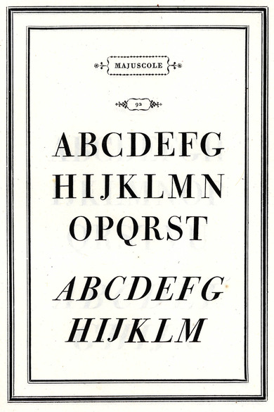
Bodoni-Antiqua
Bodoni-Antiqua
A book becomes all the more exemplary, the purer the simple beauty of the types in it. It is from out of this beauty – in one word – that the renown of book art speaks, it is in this beauty that it rests.
Giambattista Bodoni, Manuale tipografico, 1818
Antiqua is among the typefaces that have been stylistically embellished and varied by countless punchcutters and printers since the 2nd half of the 15th century. In addition to Nicolas Jenson, Aldus Manutius, Claude Garamond and others, Giambattista Bodoni concerned himself intensively with Antiqua. Based on the Roman monumental typescripts, in 1798 he developed an individually flavoured Antiqua in numerous variations that is still associated with his name today. It is regarded as the pinnacle of neo-classical type development in Italy
The contrast of different stroke widths characterises the appearance of this type. Thin serifs contrast notably with the thick basic strokes. Bodoni’s manual on book printing Manuale Tipografico (1818) contains over 170 Antiqua fonts. In the computer age, the high contrast of the type makes it difficult for digital use.

