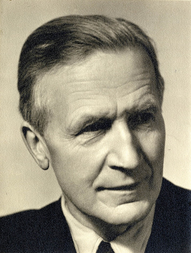
Paul Renner
Paul Renner
Technique, practicality and aesthetics are not independent subdomains in typography, but rather its faces and moments – every typographical task involves three tasks.
Paul Renner, Die Kunst der Typografie, 1940
Paul Renner first completed studies in architecture and painting before taking up employment as a book designer for the Georg Müller publishing house in Munich in 1907. Contrary to his geometrically designed Futura, which he developed for the Bauersche Gießerei typefoundry in Frankfurt am Main (1924-1927), his work was initially influenced by a historicising inclination towards the decorative book design of the 17th and 18th centuries. Shortly before the release of his theoretical work Typografie als Kunst (1922), Renner decided to turn his attention to graphic modernity, as influenced by the Bauhaus movement which had a dramatic impact during Renner’s era. Simplicity, clarity and rationality began to inform his creations and, in place of the highly popular Fraktur typefaces, Renner took a growing interest in sans-serif fonts.
Renner soon became the target of disparaging conservative accusations of “cultural Bolshevism” and in 1932 he responded to these attacks by publishing an incendiary defense of artistic modernism. In 1933, the Nazi regime dismissed him from his university teaching position after many years of service. He did, however, remain active as a painter and typeface theoretician (Die Kunst der Typographie, 1939).

