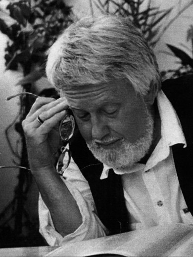
Axel Bertram
Axel Bertram
It is, above all, about the passion for the sensual image of the letters, the joy derived from the vibrantly tense form, from the familiarity of formal nuances, from the rythmising of the rows of symbols.
Axel Bertram on the things that drive him as a professional
In 1960, after studies in graphic design at the Hochschule für Bildende und angewandte Kunst (Academy of Visual and Applied Art) in the Berlin district of Weißensee, Axel Bertram began working as a freelance graphic artist in the same German city. In conjunction with three university classmates, he founded the studio collective Gruppe 4, which quickly rose to prominence thanks to projects such as the graphical redesign of Berlin’s Metropol Theatre. In the years that followed, Bertram became one of the leading graphic designers in the German Democratic Republic. He redesigned the image of a plethora of high-circulation magazines such Sibylle, Neue Berliner Illustrierte and Wochenpost and created a host of book publications which, thanks to their calligraphic design, became much loved collector’s items among bibliophiles.
Axel Bertram primarily made his name in the field of typography by designing the Videtur font, conceived specially for the display conditions of television screens, and the type writer fonts Venezia and Lutetia.

