Eurostile
The predecessor of Eurostile was the Microgramma type of 1952, which was designed by Alessandro Butti and Aldo Novarese as an uppercase typeface for bank printing purposes. Ten years later Novarese added the lowercase letters and called the typeface Eurostile. It is a sans-serif type with clean geometric forms. As part of its digitalisation by Linotype, head of design Akira Kobayashi undertook various corrections.
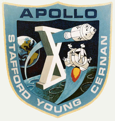
Eurostile has enjoyed great popularity, especially in the English-speaking world, since the 1960s. The British broadcaster BBC has long used the typeface for its still-picture announcements, bands such as U2 have used it in their CD booklets. Perhaps most prominently, it is a stalwart of the contemporary science fiction pop culture, such as in the TV series Doctor Who (1963-89) and Star Trek Enterprise (2001-05). NASA used it in 1969 in the design of its Apollo 10 spacecraft, whose crew carried out a test mission for the planned lunar landing before an television audience of 80 million viewers. Eurostile is also used by the Japanese technology manufacturer Toshiba as well as the European Song Contest.

