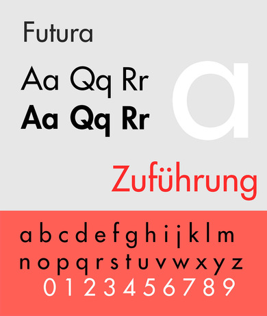
Futura
Informed by the sober and functional style of the Bauhaus movement, the Futura font was created by Paul Renner in 1928. It stands as a text book example of a sans-serif typeface. Although the design originated from a desire to express, in typographical terms, the aesthetic zeitgeist of an era, the font has long been considered a timeless masterpiece. The simple geometric forms from which Renner created the Futura letters displayed, in its early designs, a greater sense of unconventionality and underwent several phases of fine-tuning.
As an anti-traditional product of an age of engineering and machination, Futura dispensed with all forms of embellishment, exerting a provocative impact on the grounds of its massive stylistic departure from the then-customary Fraktur typeface. This is probably most apparent in the lower case letters t, u and j. As a result, the Nazis took exception to the font, viewing it as an expression of a decadent “cultural Bolshevism”. But no ideological campaign could hamper the long-term success of the typeface. A series of Futura variants were released in the years between 1950 and 1957.

