Palatino
Palatino
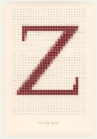
Between 1948 and 1950, the German type designer Hermann Zapf designed a typeface family called Palatino well-suited to the planographic printing method and low-quality paper used in the post-War years. It was first tested in a booklet commemorating the 200th anniversary of Goethe’s birth, and from 1955 was used in the renowned Gutenberg-Jahrbuch series. Zapf drew inspiration from the inscriptions of the Renaissance. Giambattista Palatino, an Italian calligrapher of the 16th century, was a fitting namesake. Defining characteristics of the typeface, which is often used in conservative designs, include the sharp kink on the lower base of the lowercase a and the only tangentially connected descender on the uppercase Q. The shallow bowls rising from the left on lowercase letters such as c, d or f are likewise characteristic.
Today, Palatino is among the most widely used typefaces for book printing. In 2005, the frequently illegally copied typeface was revised and digitised by Zapf and his colleague Akira Kobayashi to create the Palatino nova font.

