Quadraat
Quadraat
Although Quadraat is a digitally created typeface, it is based on manual drawings done by Dutch designer Fred Smeijers in his office in the early 1990s. He followed Antiqua archetypes, but ultimately created an original italic typeface in Quadraat Italic. In 1997, following in the footsteps if his compatriots Jan van Krimpen, Martin Majoor and Lucas de Groot, he added a sans-serif version and later added display and heading variants as well.
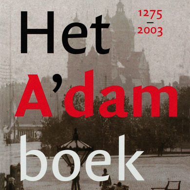
Notable is the increasingly frequent use of Quadraat as a title typeface, above all among upmarket publications such as magazines, coffee-table books and art catalogues. In designing the typeface, Smeijers deliberately took account of input from non-experts. His declared objective was to fill a perceived typographic gap: the creation of a typeface that would fit in between the classical book printing typeface Times New Roman and its chunkier predecessor Plantin.

