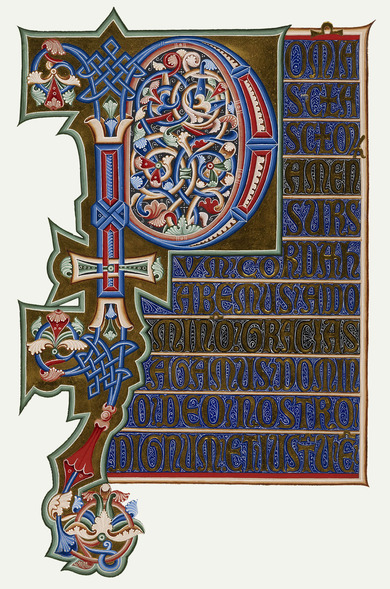
Initials
A thousand years' worth of valuable material for the history of artistic styles is contained in the ornamentation of initials.
Friedrich Bauer, Die Initialen und ihre Anwendung in alter und neuer Zeit, 1902
Ornamental letters that introduce a book, mark off chapters or take up an entire page as a form of jewellery are something of a rarity in today’s world of books. Children’s books and bibliophile prints are an exception. Whether painted by hand, raised on gold leaf, cut in wood, engraved in copper, designed as type form or illustrative design – initials have enlivened handwritten and printed texts for centuries.
As structuring and decorative elements, they were a cornerstone of book design from the Middle Ages to the 16th century. Plant ornaments, bodies of animals and mythical creatures, abstract straw and ribbon work and figurative and architectural representations constituted the multifaceted canon of motifs. While techniques from calligraphic moulding to exaggerated scroll work dominated in the Baroque period, the initials had a rather more simple typographic guise in Classicism. Since the beginning of the 20th century, font and book artists have approached these gems of book design with highly individualistic, largely objective aspirations with regard to their form.

